- Home
- Courses
- Data Science
- Data Science Essentials & Machine Learning
Curriculum
- 8 Sections
- 69 Lessons
- 4 Weeks
Expand all sectionsCollapse all sections
- Before You StartIntroduction4
- Module 1: Introduction to Data Science12
- 3.1Principles of Data Science – Data Analytic Thinking
- 3.2Principles of Data Science – The Data Science Process
- 3.3Further Reading
- 3.4Data Science Technologies – Introduction to Data Science Technologies
- 3.5Data Science Technologies – An Overview of Data Science Technologies
- 3.6Data Science Technologies – Azure Machine Learning Learning Studio
- 3.7Data Science Technologies – Using Code in Azure ML
- 3.8Data Science Technologies – Jupyter Notebooks
- 3.9Data Science Technologies – Creating a Machine Learning Model
- 3.10Data Science Technologies – Further Reading
- 3.11Lab Instructions
- 3.12Lab Verification
- Module 2: Probability & Statistics for Data Science21
- 4.1Probability and Random Variables – Overview of Probability and Random Variables
- 4.2Probability and Random Variables – Introduction to Probability
- 4.3Probability and Random Variables – Discrete Random Variables
- 4.4Probability and Random Variables – Discrete Probability Distributions
- 4.5Probability and Random Variables – Binomial Distribution Examples
- 4.6Probability and Random Variables – Poisson Distributions
- 4.7Probability and Random Variables – Continuous Probability Distributions
- 4.8Probability and Random Variables – Cumulative Distribution Functions
- 4.9Probability and Random Variables – Central Limit Theorem
- 4.10Probability & Random Variables – Further Reading
- 4.11Introduction to Statistics – Overview of Statistics
- 4.12Introduction to Statistics – Descriptive Statistics
- 4.13Introduction to Statistics – Summary Statistics
- 4.14Introduction to Statistics – Demo: Viewing Summary Statistics
- 4.15Introduction to Statistics – Z-Scores
- 4.16Introduction to Statistics – Correlation
- 4.17Introduction to Statistics – Demo: Viewing Correlation
- 4.18Introduction to Statistics – Simpson’s Paradox
- 4.19Introduction to Statistics – Further Reading
- 4.20Introduction to Statistics – Lab Instructions
- 4.21Introduction to Statistics – Lab Verification
- Module 3: Simulation & Hypothesis Testing16
- 5.1Simulation – Introduction to Simulation
- 5.2Simulation – Start
- 5.3Lab
- 5.4Simulation – Demo: Performing a Simulation
- 5.5Simulation – Further Reading
- 5.6Hypothesis Testing – Overview
- 5.7Hypothesis Testing – Introduction
- 5.8Hypothesis Testing – Z-Tests, T-Tests, and Other Tests
- 5.9Hypothesis Testing – Test Examples
- 5.10Hypothesis Testing – Type 1 and Type 2 Errors
- 5.11Hypothesis Testing – Confidence Intervals
- 5.12Hypothesis Testing – Demo with R & Python
- 5.13Hypothesis Testing – Misconceptions
- 5.14Hypothesis Testing – Further Reading
- 5.15Hypothesis Testing – Lab Instructions
- 5.16Hypothesis Testing – Lab Verification
- Module 4: Exploring & Visualizing Data4
- Module 5: Data Cleansing & Manipulation4
- Module 6: Introduction to Machine Learning4
- Final Exam & Survey4
Introduction to Statistics – Descriptive Statistics
Descriptive Statistics
Downloads and transcripts
Video Transcript
- Start of transcript. Skip to the end.
- Let’s talk about some basic descriptive statistics and
- visualization techniques.
- Now, the most useful command that I find
- in the entire world of statistics is the histogram.
- It’s a single command that I use
- the most often out of every command.
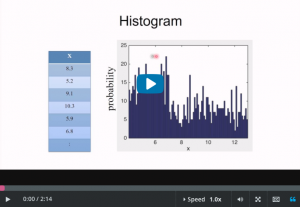
- The histogram, if you have a collection of values here,
- you can do a histogram of those values.
- And then you get something that looks like this.
- And this approximates the probability distribution
- function of random variable.
- So, if you have a pile of numbers, in my view,
- the first thing you should do is look at it.
- And you can do this in one line of code in almost any piece of
- software.
- And it’ll create equal sized bins.
- And it’ll plop your data into them.
- And it tells you how many points are in each bin.
- Boom, that’s a histogram.
- So this is telling you, for instance,
- that there are 23 numbers in your data set, here,
- between 6.86 and 6.95 or whatever.
- Now, another plotting function that I use pretty often is a bar
- chart, which is useful for categorical data.
- Okay, so let’s say that for each person, we know how they get
- to work, whether it’s bike, train, car, whatever, bus.
- And you can just plot
- the probability of each one of those categories.
- Now, a Pareto chart is exactly a bar chart except that all of
- the categories are ordered by frequency, decreasing frequency.
- Okay, so these plots are how you as a data scientist is
- gonna tell a story with data.
- So these are the building blocks of your story, the words,
- if you like.
- Now scatter plots are for when you have two variables,
- say your advertising budget and then the amount of sales.
- And you can plot them against each other here.
- So you can see as the advertising budget increases,
- the sales do, too.
- And then the very first point here, which is an advertising
- budget of 40 and sales of 43, is just that point right there.
- End of transcript. Skip to the start.