- Home
- Courses
- Data Science
- Data Science Essentials & Machine Learning
Curriculum
- 8 Sections
- 69 Lessons
- 4 Weeks
Expand all sectionsCollapse all sections
- Before You StartIntroduction4
- Module 1: Introduction to Data Science12
- 3.1Principles of Data Science – Data Analytic Thinking
- 3.2Principles of Data Science – The Data Science Process
- 3.3Further Reading
- 3.4Data Science Technologies – Introduction to Data Science Technologies
- 3.5Data Science Technologies – An Overview of Data Science Technologies
- 3.6Data Science Technologies – Azure Machine Learning Learning Studio
- 3.7Data Science Technologies – Using Code in Azure ML
- 3.8Data Science Technologies – Jupyter Notebooks
- 3.9Data Science Technologies – Creating a Machine Learning Model
- 3.10Data Science Technologies – Further Reading
- 3.11Lab Instructions
- 3.12Lab Verification
- Module 2: Probability & Statistics for Data Science21
- 4.1Probability and Random Variables – Overview of Probability and Random Variables
- 4.2Probability and Random Variables – Introduction to Probability
- 4.3Probability and Random Variables – Discrete Random Variables
- 4.4Probability and Random Variables – Discrete Probability Distributions
- 4.5Probability and Random Variables – Binomial Distribution Examples
- 4.6Probability and Random Variables – Poisson Distributions
- 4.7Probability and Random Variables – Continuous Probability Distributions
- 4.8Probability and Random Variables – Cumulative Distribution Functions
- 4.9Probability and Random Variables – Central Limit Theorem
- 4.10Probability & Random Variables – Further Reading
- 4.11Introduction to Statistics – Overview of Statistics
- 4.12Introduction to Statistics – Descriptive Statistics
- 4.13Introduction to Statistics – Summary Statistics
- 4.14Introduction to Statistics – Demo: Viewing Summary Statistics
- 4.15Introduction to Statistics – Z-Scores
- 4.16Introduction to Statistics – Correlation
- 4.17Introduction to Statistics – Demo: Viewing Correlation
- 4.18Introduction to Statistics – Simpson’s Paradox
- 4.19Introduction to Statistics – Further Reading
- 4.20Introduction to Statistics – Lab Instructions
- 4.21Introduction to Statistics – Lab Verification
- Module 3: Simulation & Hypothesis Testing16
- 5.1Simulation – Introduction to Simulation
- 5.2Simulation – Start
- 5.3Lab
- 5.4Simulation – Demo: Performing a Simulation
- 5.5Simulation – Further Reading
- 5.6Hypothesis Testing – Overview
- 5.7Hypothesis Testing – Introduction
- 5.8Hypothesis Testing – Z-Tests, T-Tests, and Other Tests
- 5.9Hypothesis Testing – Test Examples
- 5.10Hypothesis Testing – Type 1 and Type 2 Errors
- 5.11Hypothesis Testing – Confidence Intervals
- 5.12Hypothesis Testing – Demo with R & Python
- 5.13Hypothesis Testing – Misconceptions
- 5.14Hypothesis Testing – Further Reading
- 5.15Hypothesis Testing – Lab Instructions
- 5.16Hypothesis Testing – Lab Verification
- Module 4: Exploring & Visualizing Data4
- Module 5: Data Cleansing & Manipulation4
- Module 6: Introduction to Machine Learning4
- Final Exam & Survey4
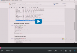
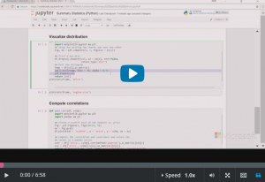
Introduction to Statistics – Demo: Viewing Summary Statistics
Demo: Viewing Summary Statistics
For a demonstration of how to view summary statistics using R, watch the first video in this topic. For a Python-based demonstration, scroll down and view the second video.
Viewing Summary Statistics in R
Downloads and transcripts
Video – Viewing Summary Statistics in R
Viewing Summary Statistics in Python
Downloads and transcripts
Video Transcript -Viewing Summary Statistics in R
- Start of transcript. Skip to the end.
- so Cynthia has been discussing how
- summary statistics are computed with the
- formulas are a little bit about how we
- interpret them and this demo i’d like to
- show you how we actually compute the
- summary statistics using our and we’ll
- talk about some practical issues of what
- we can do to interpret summary
- statistics
- so my screen here i have a notebook
- which I’ve started in Azure machine
- learning and this first cell contains
- the auto-generated code which takes my
- data set
- automobile price data raw dot CSV and
- gives me back and our data frame here so
- let me just run that code
- they’re so we have the data frame loaded
- it’s named at
- in another auto-generated piece of code
- we can see the head so basically the
- first five rows of that data frame
- about 200 automobiles in this data set
- and i’m not going to talk about every
- column at this point let’s just talk
- about the ones we care about so this
- column called horsepower gives you the
- horsepower of the car’s engine city
- miles per gallon gives you the miles per
- gallon of that car and city driving and
- price is the price of that car
- simple enough
- but there is a problem there are missing
- values in this
- in some of these numeric columns so this
- code
- basically iterates over these numeric
- columns we’re looking for a text string
- ? that indicates a missing value we’re
- going to replace it with and RNA value
- and then we use there’s an R function
- called complete cases so complete cases
- returns a true if the row has no missing
- values it returns false
- if the row has a missing value so we
- wind up with a clean data frame and then
- we make sure we have coerced all those
- columns to numeric so let me run this
- for you oh and then we’re going to run
- the stir function on that so we’ll we’ll
- see a summary of some of those data
- alright so there’s the summary of these
- columns in the data
- the ones we care about horsepower it’s a
- numeric looks like they’re all integers
- city miles per gallon again now is
- actually integer is an integer and they
- look like integers price is numeric
- so those are the three columns that we
- care about
- we’re not going to look at the rest of
- these just now
- and we can compute some summary
- statistics so there’s a
- summary function in our
- actually called summary
- and we’ll so we select the column we
- want from the data frame we run summary
- on it i’m doing some things too
- add the standard deviation which doesn’t
- normally show up in the summary
- statistics the way our does it and give
- it some proper names and so we’ll just
- do that for one column will do it for
- price
- and there we have it
- so first off let’s look at the mean mean
- is just a little over 13,000
- but notice that the median is just
- barely over 10,000 so it’s much lower
- and that indicates that discrepancy
- between mean and median indicates that
- we have probably some asymmetry in this
- distribution we also have a pretty wide
- standard deviation about of 8,000 on a
- mean of 13,000 so it indicates a
- widespread and you can see the minimum
- is only about five thousand whereas our
- most expensive car in this data set is
- over 45,000 so again indicating there’s
- a wide range of data values a wide
- spread or dispersion of those data and
- if you look at the
- these first
- third quartile so it’s the 25-percent in
- 75% you see there’s quite a around the
- median there’s quite a bit of asymmetry
- in those differences so we’re expecting
- a distribution where they’re more
- cheaper cars and fewer more fewer
- expensive cars just from examining those
- summary statistics
- and we can check that we can check that
- visually so this code here
- i’m using the g plot to package which
- we’ll talk about in future lessons but
- i’m going to make a histogram and I’m
- going to make a box plot
- and
- and we’re just going to lay those one on
- top of the other
- two robes basically so let me run that
- for you
- alright so let’s start with our box plot
- Cynthia discuss the box plot the dark
- line here is our median value which as
- we expect is just over 10,000 and look
- at this first lower quartile it’s pretty
- narrow compared to this first upper
- quartile again very much indicating
- strong asymmetry and this whisker is
- pretty short here down to the minimum
- value which was around little over five
- thousand whereas this whisker is quite
- long as it’s one and a half times the
- interquartile range which is as long as
- the whisker can be and then we have some
- cars that are really quite expensive you
- see these few outlier cars very
- expensive cars are shown in the dots
- we can get a different view of that from
- the histogram and you see the most
- frequent price of cars is in here maybe
- maybe it’s around eight thousand dollars
- or something so relatively inexpensive
- cars there’s a lot of an expensive cars
- and the distribution tapers off and we
- only have these few cars that are over
- 30 thousand dollars those correspond to
- are outliers here
- and we can look at one other
- column engine size which will use later
- to get we see it’s a little less
- asymmetric because you see the court
- interquartile the quartile range of this
- little first lower quartile is only
- slightly smaller than the range of this
- first upper quartile the whiskers only
- slightly shorter than the upper whisker
- we still do have a few outliers and the
- histogram helps confirm that idea
- you see we have a few cars with very
- small engines we have kind of a cluster
- of cars plus or minus around a hundred
- cubic inches and we have a few cars with
- really large engines
- so I hope that this demo has given you
- some idea of
- practical aspects of just computing
- summary statistics but also when you
- look at a dataset you’re trying to
- understand the variables how a few
- summary statistics can really give you
- an initial guidance into some aspects of
- the behavior of those variables
- End of transcript. Skip to the start.
Video Transcript – Viewing Summary Statistics in Python
- Start of transcript. Skip to the end.
- so Cynthia has been discussing summary
- statistics and how we compute summary
- statistics and how we interpret summary
- statistics and in this demo I’m going to
- show you some actual code where we’re
- computing summary statistics and
- specifically we’re going to use some
- Python to compute some summary
- statistics and we’ll talk a little bit
- about what they mean
- so my screen here i have my notebook
- that i started in Azure machine learning
- and this first
- cell is the auto-generated code from
- Azure machine learning when I started
- the notebook from this automobile price
- data raw dot CSV data set
- ok so let me just load that’ll get us a
- data frame
- there we go and the auto-generated code
- would just give you the whole frame it
- would just have the word frame here
- which is the the name of our pandas
- dataframe but i’ve added this dot head
- so we just see the first five rows
- there we go and I’m not going to discuss
- all these wrote columns but surprises to
- say there’s about 200 automobiles in
- this sample and what we’re going to look
- at only is the horsepower of each car
- the park city miles per gallon of each
- car and the price of each car so we’re
- going to do some summary statistics on
- those three columns but there’s a little
- issue there are some missing values
- there so this code here for some of
- these numeric columns we that look
- through and find where the value is
- coded as a ? a text string ? and then we
- remove those rows we drop those rows so
- we’re just going to throw them out
- not going to worry about them and then
- we have to coerce them back to numeric
- so that’s all we’re doing there
- let me run that for you and I printed
- what’s called the info on that data
- frame and let’s just scroll to the
- bottom so which are the columns we care
- about
- so we’ve got horsepower
- and we see there’s a hundred ninety-five
- values that are non null and it’s a
- integer we have city miles per gallon
- which again the 995 non null values
- which is also an integer in our price
- which is the same as the others also an
- integer so that’s what we’re going to
- work on us those three so let’s start by
- using
- some the pandas described method here
- computes summary statistics so this
- little function we give it the name of a
- data frame when we call it and we give
- it the column name that we want the
- summary statistics for so in this case
- price and
- there’s a little bit of managing here
- just to get the name median in our list
- so that’s just a detail and I’ve
- computed those summary statistics and
- you can see as we already knew there’s a
- hundred ninety five cases
- the mean is a little over 13 thousand
- dollars the median is quite a bit less
- it’s just barely ten thousand dollars so
- that would indicate to me that there’s
- quite a lot of asymmetry in the
- distribution of the price of these
- automobiles the standard deviations
- about eight thousand dollars are so we
- expect quite a spread of
- auto prices the minimum is a little over
- five thousand dollars and the maximum is
- over 45,000 dollars so again confirming
- we have a widespread asymmetric
- distribution here arm and if you look at
- these twenty-five percent 75% want
- quantiles that also confirms that
- initial hypothesis
- but we can also visualize that
- distribution and I’ve just got a little
- bit of code here to do that and
- all I’m going to do is compute a
- histogram
- and a boxplot
- of those two and i’m going to stack them
- one on top of the other so that’s all
- that code is doing and we’ll talk about
- later the details of Python plotting but
- let me just run that for you
- and there you have it so as Cynthia
- discuss the box plot
- we’ve got the median shown in the red
- bar here we’ve got the this first lower
- quartile here in this first upper
- quartile here around the median so again
- there’s definitely a symmetry look at
- this range here is much shorter than
- this range there and we have a short
- whisker here a long whisker they’re
- going out to one of the head it’ll be
- one and a half times the interquartile
- range and then we have a bunch of
- outlier so basically we have a lot of
- relatively inexpensive cars
- in a few very expensive cars if we look
- at the histogram we get a different view
- of that that’s basically has the same
- interpretation you can see the most
- frequent auto price is probably around
- seven or eight thousand dollars in this
- data set and only a few cars or say over
- thirty thousand dollars so it’s very
- asymmetric and of course because it’s
- the price of cars there are no cars the
- at or near zero and so let’s look at one
- other statistic here we’ll just look at
- engine size
- we’re just going to plot that and again
- it it’s a little more symmetric looking
- in the box plot but again we have a few
- outliers here
- and if we look at that histogram we can
- see that the most frequent value is
- probably in the low hundreds of horse
- pass hundred and something hundred and
- twenty horsepower maybe are very few
- cars with extremely low horsepower
- and a number of cars just a few cars
- with very high horsepower
- so I hope that gives you some idea of
- how to compute in practice some summary
- statistics and how we think about them
- to to do an initial exploration of some
- data
- End of transcript. Skip to the start.