- Home
- Courses
- Data Science
- Data Science Essentials & Machine Learning
Curriculum
- 8 Sections
- 69 Lessons
- 4 Weeks
Expand all sectionsCollapse all sections
- Before You StartIntroduction4
- Module 1: Introduction to Data Science12
- 3.1Principles of Data Science – Data Analytic Thinking
- 3.2Principles of Data Science – The Data Science Process
- 3.3Further Reading
- 3.4Data Science Technologies – Introduction to Data Science Technologies
- 3.5Data Science Technologies – An Overview of Data Science Technologies
- 3.6Data Science Technologies – Azure Machine Learning Learning Studio
- 3.7Data Science Technologies – Using Code in Azure ML
- 3.8Data Science Technologies – Jupyter Notebooks
- 3.9Data Science Technologies – Creating a Machine Learning Model
- 3.10Data Science Technologies – Further Reading
- 3.11Lab Instructions
- 3.12Lab Verification
- Module 2: Probability & Statistics for Data Science21
- 4.1Probability and Random Variables – Overview of Probability and Random Variables
- 4.2Probability and Random Variables – Introduction to Probability
- 4.3Probability and Random Variables – Discrete Random Variables
- 4.4Probability and Random Variables – Discrete Probability Distributions
- 4.5Probability and Random Variables – Binomial Distribution Examples
- 4.6Probability and Random Variables – Poisson Distributions
- 4.7Probability and Random Variables – Continuous Probability Distributions
- 4.8Probability and Random Variables – Cumulative Distribution Functions
- 4.9Probability and Random Variables – Central Limit Theorem
- 4.10Probability & Random Variables – Further Reading
- 4.11Introduction to Statistics – Overview of Statistics
- 4.12Introduction to Statistics – Descriptive Statistics
- 4.13Introduction to Statistics – Summary Statistics
- 4.14Introduction to Statistics – Demo: Viewing Summary Statistics
- 4.15Introduction to Statistics – Z-Scores
- 4.16Introduction to Statistics – Correlation
- 4.17Introduction to Statistics – Demo: Viewing Correlation
- 4.18Introduction to Statistics – Simpson’s Paradox
- 4.19Introduction to Statistics – Further Reading
- 4.20Introduction to Statistics – Lab Instructions
- 4.21Introduction to Statistics – Lab Verification
- Module 3: Simulation & Hypothesis Testing16
- 5.1Simulation – Introduction to Simulation
- 5.2Simulation – Start
- 5.3Lab
- 5.4Simulation – Demo: Performing a Simulation
- 5.5Simulation – Further Reading
- 5.6Hypothesis Testing – Overview
- 5.7Hypothesis Testing – Introduction
- 5.8Hypothesis Testing – Z-Tests, T-Tests, and Other Tests
- 5.9Hypothesis Testing – Test Examples
- 5.10Hypothesis Testing – Type 1 and Type 2 Errors
- 5.11Hypothesis Testing – Confidence Intervals
- 5.12Hypothesis Testing – Demo with R & Python
- 5.13Hypothesis Testing – Misconceptions
- 5.14Hypothesis Testing – Further Reading
- 5.15Hypothesis Testing – Lab Instructions
- 5.16Hypothesis Testing – Lab Verification
- Module 4: Exploring & Visualizing Data4
- Module 5: Data Cleansing & Manipulation4
- Module 6: Introduction to Machine Learning4
- Final Exam & Survey4
Introduction to Statistics – Demo: Viewing Correlation
Demo: Viewing Correlation
For a demonstration of how to view correlation using R, watch the first video in this topic. For a Python-based demonstration, scroll down and view the second video.
Viewing Correlation in R
Downloads and transcripts
Viewing Correlation in Python
Downloads and transcripts
Video Transcript -Viewing Correlation in R
- Start of transcript. Skip to the end.
- Cynthia has been discussing how the
- formulas for computing correlations and
- a bit about how you interpret
- correlations in this demo i’d like to
- show you how to compute correlations
- using our and we’ll talk about some
- practical aspects of how we understand
- what those correlations mean when we
- apply them to real-world data
- so on my screen here i have a function
- that I’ve created which i call auto dot
- core so it’s going to compute the
- correlation between some variable sum in
- like in this case the defaults engine
- size and the price and we’re first off
- we’re going to use ggplot2 again to just
- make a scatter plot of those two
- variables and then we’re going to
- compute the covariance using that are
- cold function
- and the correlation using the core
- function
- and we’re going to just print print some
- summaries of that result so let me do
- that for the first case
- ok so coral covariance
- between engine size and price is around
- 30,000 well it’s positive it’s a big
- number but what does that big number
- mean it’s very hard to interpret in my
- view because
- we have price and its units and engine
- size and in units of cubic inches it’s
- it’s it’s not clear what thirty thousand
- means is that highly is there a strong
- relationship or a weak relationship but
- correlation we have the advantage that
- we’ve normalized by the variance of
- those variables and we can see it’s just
- about almost point nine which is fairly
- strong correlation and if we look at the
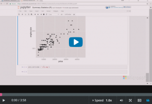
- scatter plot of engine size on the
- vertical and price on the horizontal you
- can see that indeed there’s a pretty
- strong and pretty almost straight line
- relationship between engine size and
- price of the car and that makes sense of
- babe a more expensive car with a is
- going to have a big engine or conversely
- large engines tend to be cost more so
- the cars are costs more
- let’s look at another relationship here
- so this case we’re going to look at the
- relationship between price and city
- miles per gallon
- and now we’ve got numerically a larger
- at magnitude of covariance 36,000 as
- opposed to 30,000 before against clear
- what that means is that really a
- stronger relationship or not it’s
- definitely negative
- but if i look at the correlation the
- normalized value its minus so negative
- point seven so the magnitude is quite a
- bit less for the relationship between
- City miles per gallon and price as we
- just saw between engine size and price
- and if i look at this plot i can see
- there’s kind of a more of a curved
- relationship
- now that relationship makes sense again
- that small fuel-efficient cars that
- caught costless large gas guzzlers cost
- more
- okay fair enough but we’re not properly
- with us with any sort of straight line
- type statistic like correlation we’re
- not properly capturing this curvy
- relationship
- so I hope this little demo has given you
- some insight into the uses and
- limitations of covariance and
- correlation and how you can use them to
- gain some insight into your data sets
- End of transcript. Skip to the start.
Video transcript – Viewing Correlation in Python
- Start of transcript. Skip to the end.
- Cynthia has been discussing correlations
- and how they’re the formulas for how
- they’re computed, and some information
- on how they are interpreted. In this demo
- i’d like to show you how we’re going to
- use some tools in Python to compute some
- correlations and we’ll talk about what
- those results mean
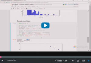
- so my screen here I have the same
- notebook we started in the previous demo
- where we looked at some summary
- statistics for price and engine size and
- I have this function here where I can
- now
- first off I look at the relationship
- between two variables
- we’re just going to make a scatter plot
- of those and then we’re going to compute
- the correlation and the covariance using
- this
- not too surprisingly the CORR method
- and the covariance method COV. One little
- trick those are numpy methods so you
- have to always make sure you convert to
- a matrix any values you’re feeding to
- those functions or else
- they have things are going to happen so
- anyway not too complicated but let me
- just run it and we’ll see what happens
- alright so first off let’s look at the
- covariance it’s a little hard for me to
- interpret that number you know it’s it’s
- about 30,000 but we’re computing that
- based on units of price of the
- automobile and engine size which is the
- engine size and it turns out cubic
- inches of this data set so it’s not
- clear to me just thinking about that is
- 29,000 or 20 or 30,000 high low or what
- but here’s correlation which is the
- normalized version of covariance right
- we’ve normalized by the variance of both
- of engine size and price and it’s almost
- point nine so that indicates to me a
- fairly high positive correlation between
- those two variables and if i look at my
- scatter plot here
- it does look like there’s this pretty
- good relationship between those two
- variables we have engine size on the
- vertical axis we have price of the
- automobile on the horizontal axis and
- you can see there’s a pretty straight
- line relationship there for the most
- part is not exactly but for the most
- part and so you can say these variables
- are reason have a reasonably strong
- positive correlation
- but let’s try another set let’s try this
- time City miles per gallon and price of
- the automobile so i’m going to run that
- and it’s okay so my covariance now is
- negative and it’s a bit larger then what
- we had before but I’m not sure whether
- larger really means much but it
- definitely negative
- if i look at my correlation again it’s
- negative but it’s there’s less court
- that the magnitude is less than what we
- saw with engine size so it’s now about
- points7 and if we look at the
- scatterplot we see why there is a pretty
- strong relationship here but it’s it’s
- it’s not anything like a straight line
- it’s definitely some sort of curve
- um so there’s a less direct relationship
- between City miles per gallon price if
- you think about this
- both of these numbers make sense
- correlation of engine size with price
- cars with big engines tend to be big
- cars tend to be more expensive small
- cars that get high
- fuel efficiency
- like up here tend to be are cheap cars
- and big expensive cars tend to have low
- fuel efficiency
- so I hope this little demo has given you
- some idea of how to think about giving
- you a feel for the practical uses and
- limitations of covariance in correlation
- End of transcript. Skip to the start.