Present Your Project KPIs Clearly and Join the Business Intelligence Revolution
Dashboard for increased project visibility – Helping stakeholders see the key areas of a project easily involves communicating important data points of the project with employees, your CEO or shareholders. The dashboard is perfectly tailored—literally, you can create a dashboard according to your exact specifications!—for meeting these needs. Use a well-designed dashboard, and you will gain a critical tool for increasing visibility and communicating valuable insights into key performance indicators (KPIs) that will allow a business or project to be measured and executed.
With the growing importance of business intelligence (BI), being able to create a dashboard in Excel is a must-have skill for executives, project managers and group leaders, financial personnel and auditors, and anyone else who needs to analyze data for a corporate purpose. However, there’s no “create a dashboard” command in Excel. Creating a dashboard involves using a combination of tools that are built in to Excel.
Understanding of dashboards is essential: it goes beyond simply understanding the elements of the dashboard, to actually understanding why you should create the dashboard and to what end. This post will discuss what to consider when creating a dashboard and how Excel’s tools can be used for creating effective dashboards and getting your projects the visibility they need.
Define Key Stakeholders and Data Types
Before you do anything else, decide what your dashboard will do. This is the moment to identify the key stakeholders in the project, and involve them in a discussion of what is expected not just from the dashboard, but also from the project. The dashboard is meant to convey specific information on the project or team, whether it’s the completion and status of tasks on a project, or measuring business performance through well-defined KPIs.
Once you decide what the goal of your dashboard is, learn what data needs to be added to the dashboard to meet that specific need and to convey that information. Determine whether the dashboard will be dynamic, with real-time updates using macros or VBA, or whether it can be updated weekly, bi-monthly or monthly.
You must then decide who is going to be able to see all this information—the stakeholders of the project are a good bet, including the project manager, employees, vendors or clients who need to see this information. You also need to decide who among these people, if any, would have editing rights.
Once you’ve decided on these points, it’s time to conceptualize what the dashboard will look like and what elements it will include.
Building a Structure for Your Dashboard
Dashboards can be created using multiple elements, from static tables, filters and auto-shapes to PivotTables, PivotCharts, slicers and formulas.
If you want to create a dashboard that is dynamic and responsive, you can choose to use dynamic charts, PivotTables and even widgets. There are many different elements that can be used to create your dashboard. To create a visual conceptualization of your dashboard:
- Group similar data together
- Decide which elements to use to represent particular data
- Color code processes in the project flow
- Decide how the different elements fit together on the worksheet
Once you have an idea of how your dashboard should look, you can begin adding data to your dashboard.
Add Data and Tie It All Together
Start by importing your data into Excel. Create a workbook with multiple tabs, where one sheet will contain the dashboard and another will contain the raw data. Copy and paste your raw data into the sheet, and ensure the data is in a Table for ease of calculation.
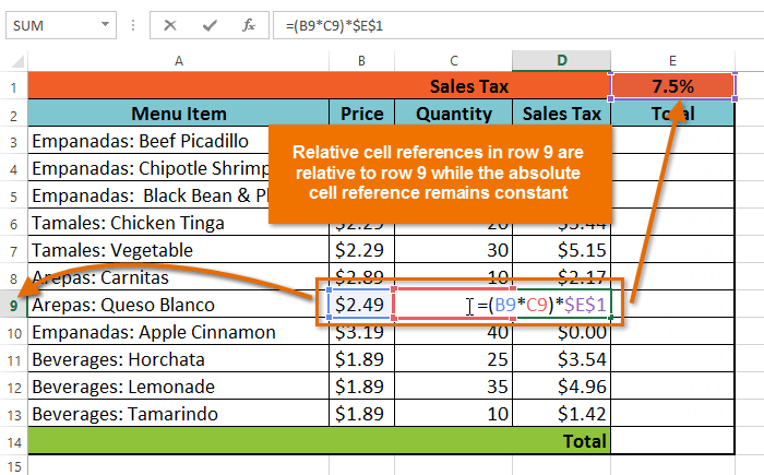
The next step is to analyze your data: clean the data, if required, check to see if some or all of it will be used, and use formulas wherever necessary. The SUM function, the COUNT function, and, for filtered data, the SUBTOTAL function are all useful for elementary analysis. The DAYS function is also useful for projects. You can use nested IF functions, VLOOKUPs and more to analyze your data.
Once you’ve worked on the data, the next step is the presentation within the dashboard. To add a PivotTable, select the Insert tab and click the PivotTable button. Select the table or range from the sheet containing the raw data, and choose to place the PivotTable in the dashboard sheet. Choose the fields to add in the rows, columns, and filter tabs.
To add a chart, click the Insert tab and choose the type of chart you want to display data in. In the Select Data Source dialog box, add the legend entries and select the data to be included in the chart from your raw data sheet.
The Gantt chart is especially useful for visually showing a project’s timeline. To add a Gantt chart to the dashboard, click the Insert tab in the sheet and choose the bar chart from the Charts section, and choose the second type of bar chart. There are many more elements you can use in your dashboard, including dynamic elements that update data in real time.
Leverage Excel’s Data Analysis Capabilities
The dashboard is an important tool you can use today to leverage Excel’s power of data analysis and make critical business decisions.
(This post first appeared in a ProfEd blog)
By Niyati Behl on October 16, 2017